Fintech Forms
Internal Error Correction Forms
Project Overview
Pain Point:
The current state of forms for this particular firm were all manually managed across 3 main offices: front office (client facing), middle office (branch facing), and back office (systemic management). This resulted in long SLAs for any related process. This lowered user and client satisfaction.
Primary Questions to Answer:
How to minimize the amount of time, effort, and friction involved in the current form entry process?
How to create an optimal end-to-end workflow that lessened the SLA in a substantive way and worked seamlessly between the different offices?
Identified End Users:
Middle and Back Office administrators, or in layman’s terms. Branch office workers and corporate system administration. This can include Financial Advisors, their staff, and the support staff at home office.
Research Phase
Discovery research:
With the help of a researcher, we planned and executed a series of user interviews. The goal was to establish the current workflow, end to end. Through a series of stakeholder interviews, we discovered that the is little to no uniformity to how the users navigate filling out paperwork. Instead, we collected and using an affinity map, determined high level pain points to the process and discovered several universal pain points.
Refinement of Pain Points:
From the journey map, we identified several pain points. These were as follows:
The process relies on individual humans to manually enter the forms into the system.
This results in manual entry errors.
The process is very time consuming. Each office required, at least, 48 hours to do their portion. Making the process end-to-end average around 7 to 10 business days. This leads to extreme dissatisfaction from the clients and the branches are receiving the brunt of that dissatisfaction.
In the case of error corrections, time is essential and taking 10 days to correct a transaction was unacceptable to branch staff and the clients they served. Further, it was not uncommon for an error form to be needed to correct an error form, previously entered; each correction exponentially increasing the time between error identification and resolution. This was identified as the more urgent issue.
As a result, we refined our problem statement to the following:
“How do we shorten the time from error identification to resolution and streamline the process to give the branches and back office administrators more of their time back?”
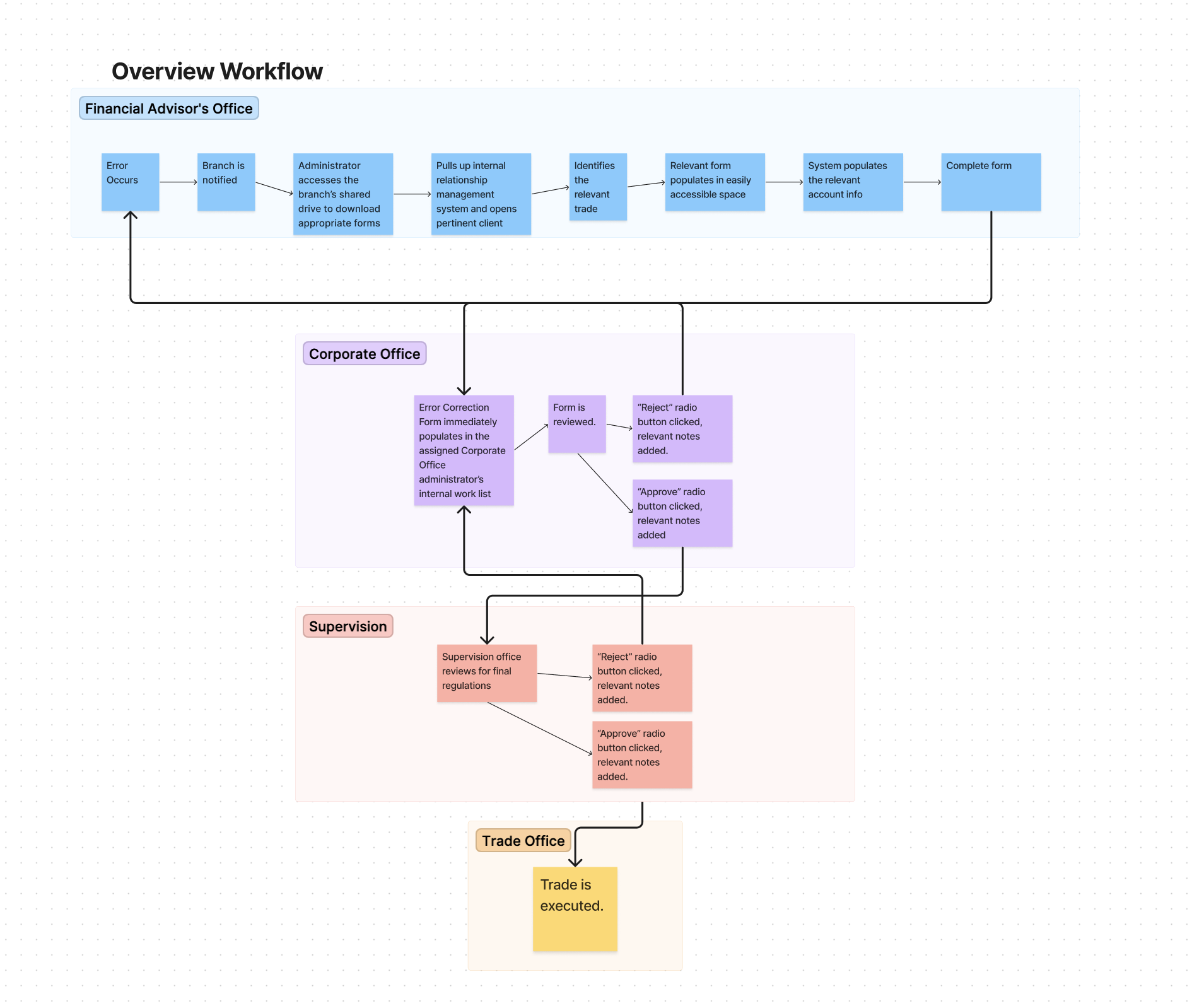
Low fidelity sketch of proposed workflow
Streamlining the Workflow
Wireframing:
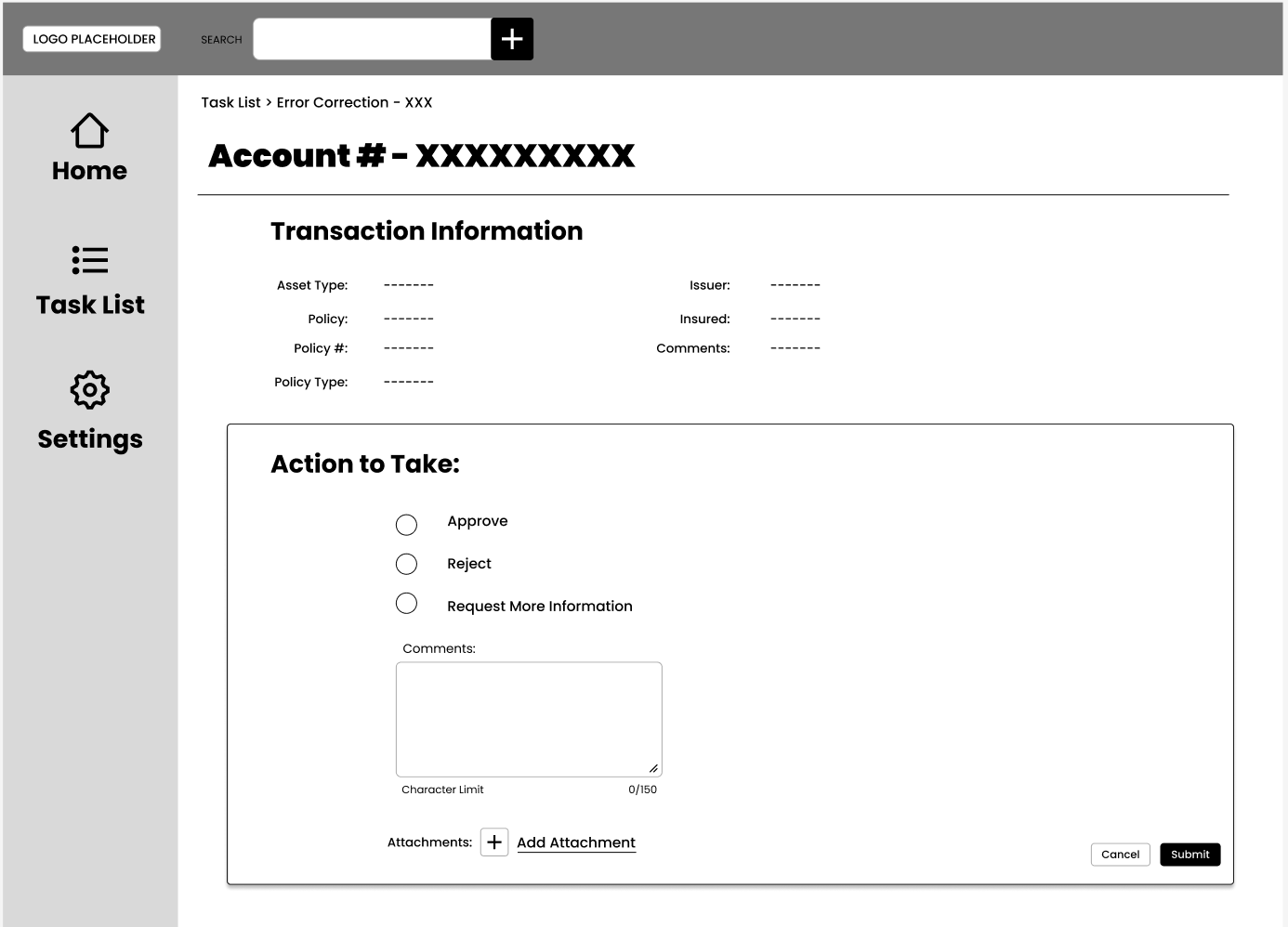
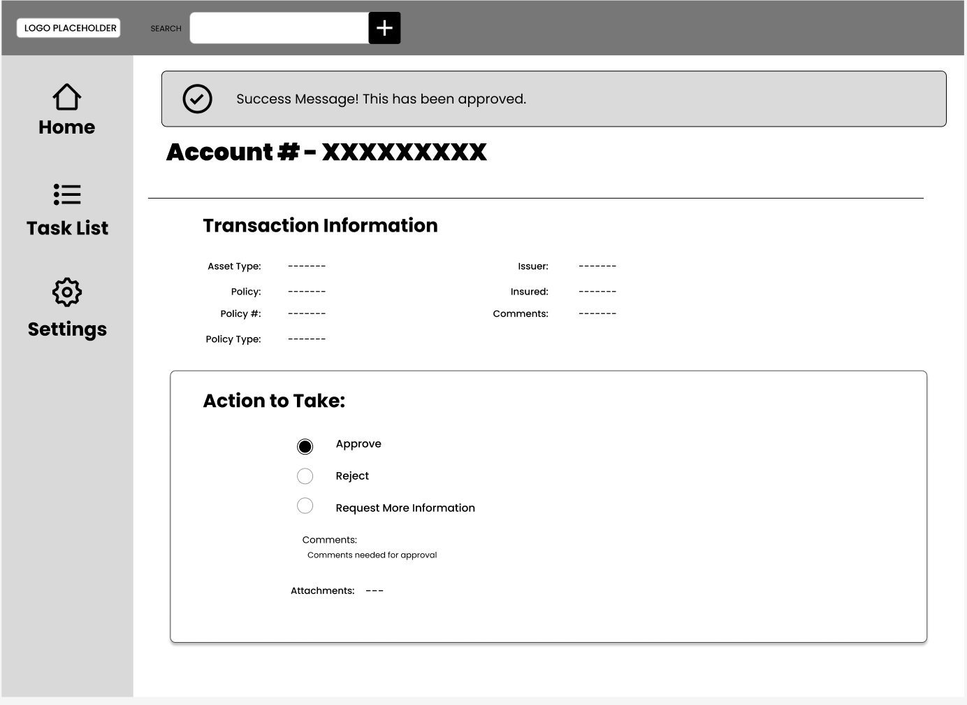
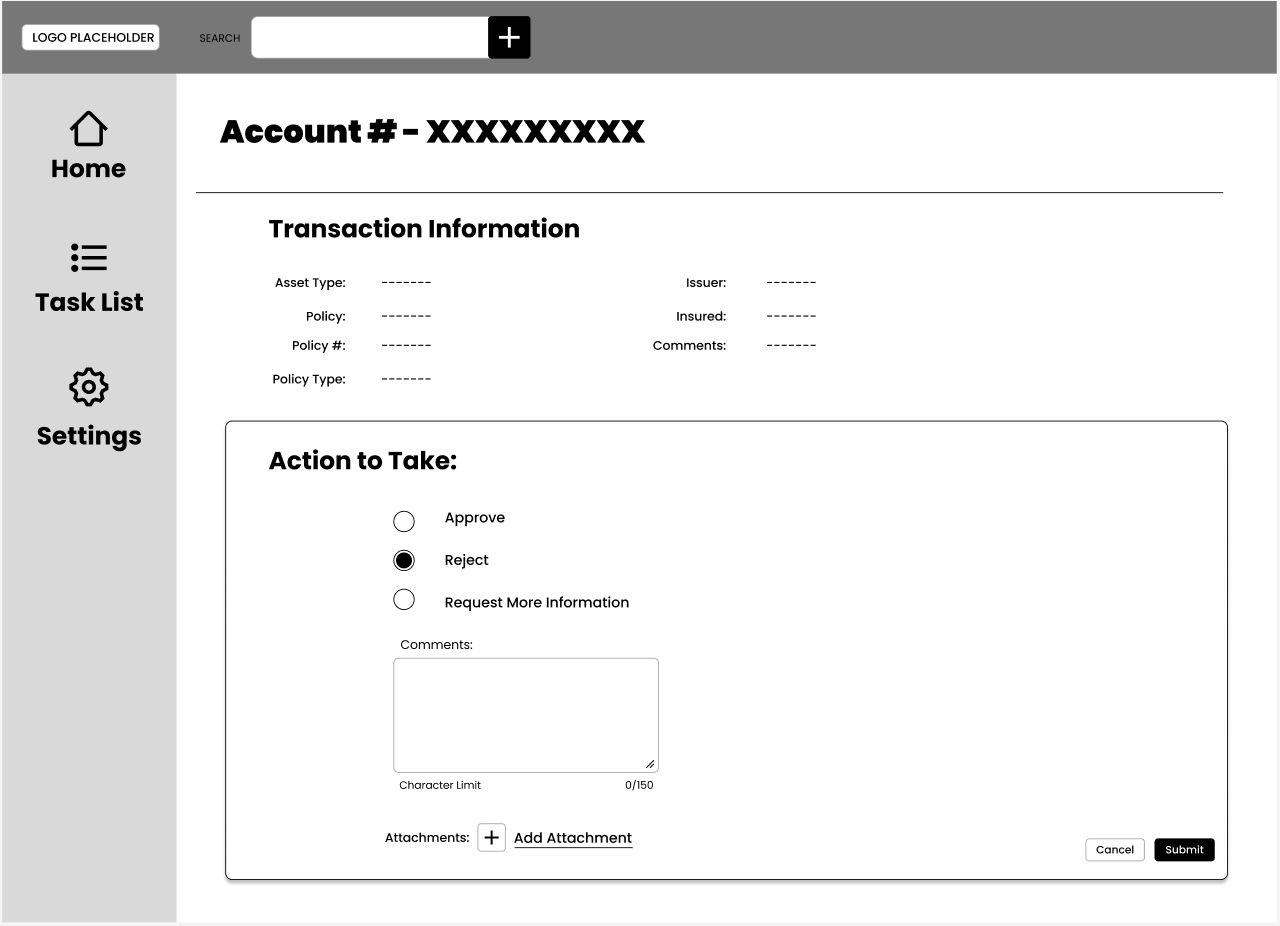
Armed with our user’s ideal workflow, I started sketching. Business provided me with the current fields on the paper forms to make a good start. Some of those explorations are depicted below.
Wireframe for “Approve Request”
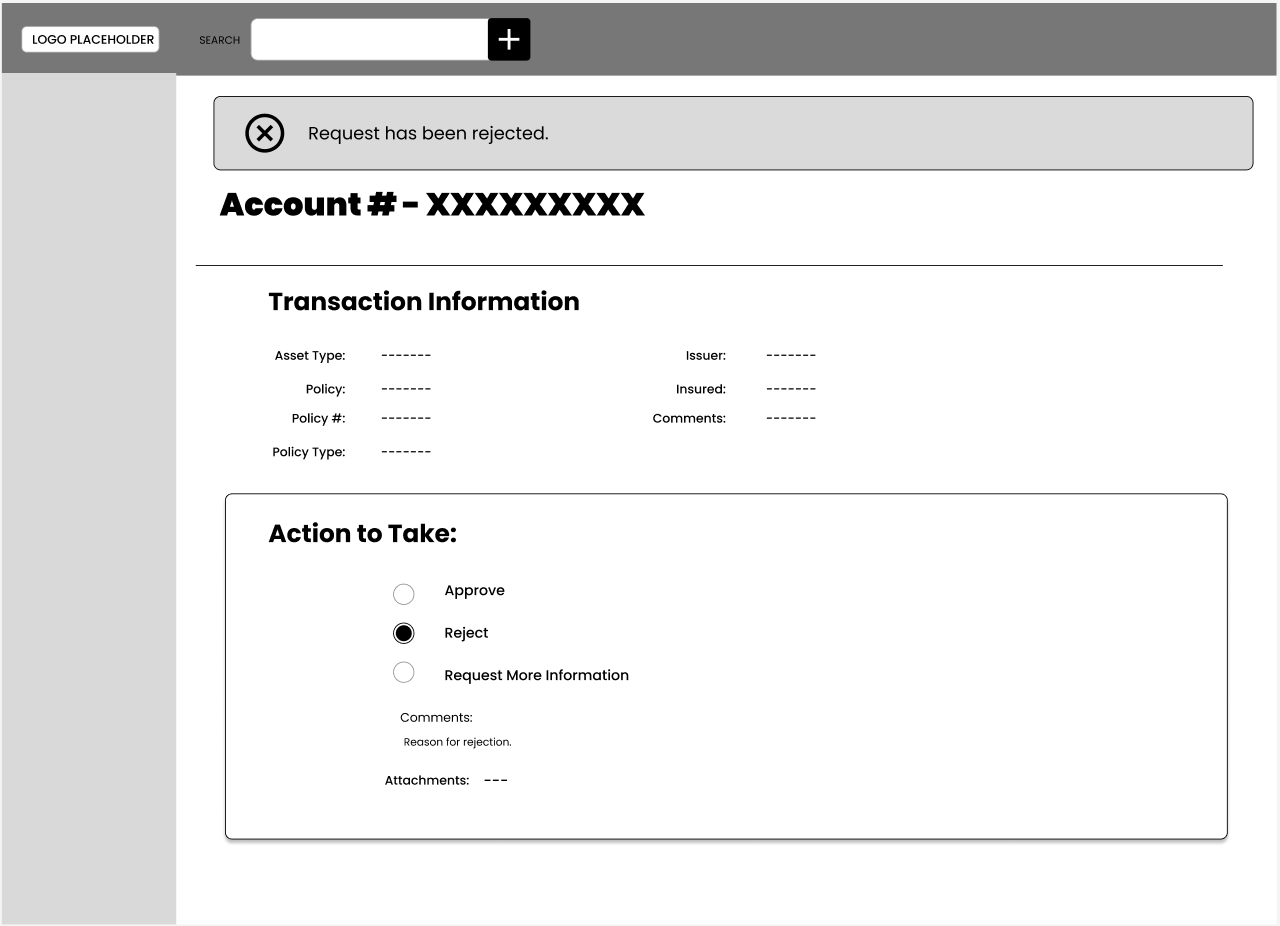
Wireframe for “Reject Request”
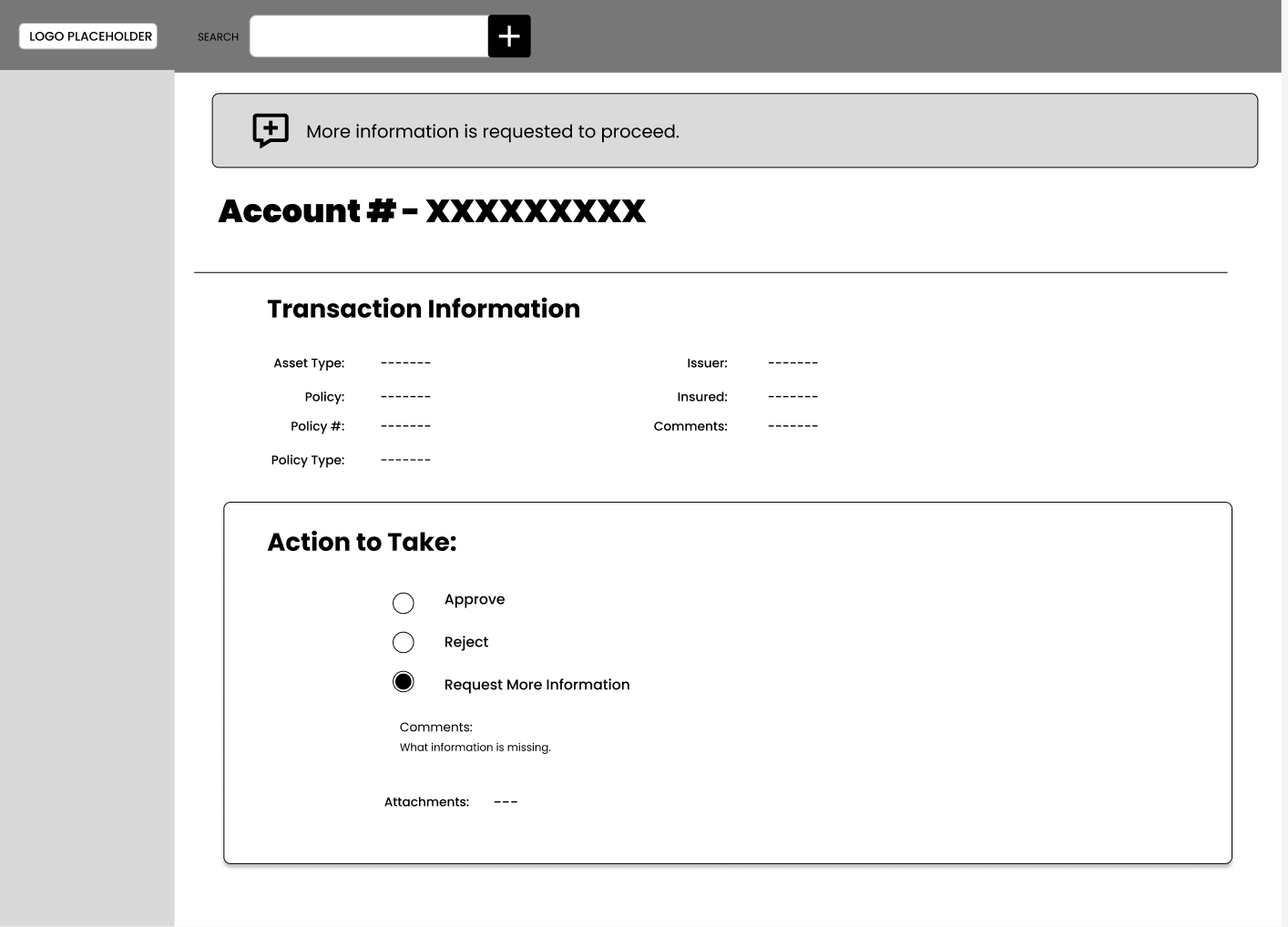
Wireframe for “Request More Information”
User Interviews
After wireframing the initial proposed workflow, I worked with my team to refine the workflow. We went through 2 rounds of 1 on 1 interviews, where we came to the following conclusions:
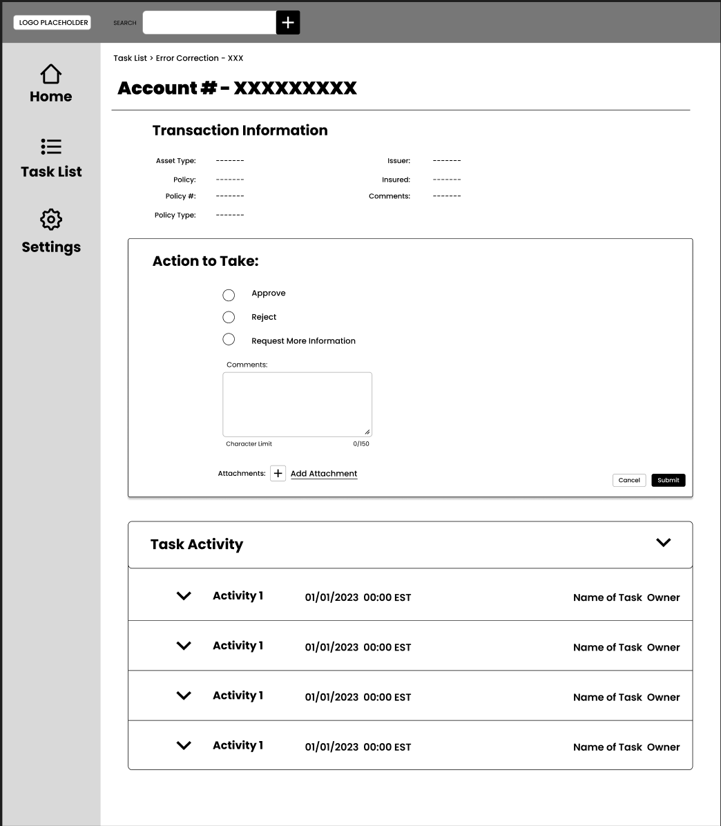
Users valued context over all else. Anything that can answer the “why” for them in an efficient and easy way is an immediate value add.
They preferred visual indications with next steps clearly laid out.
They are not necessarily bothered by “walls” of information, but need all information to be relevant. Content strategy is key for any future development.
Example below is an example from the resulting wireframes:
Translating to the Internal Design System
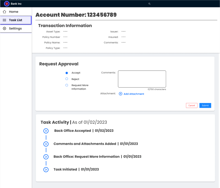
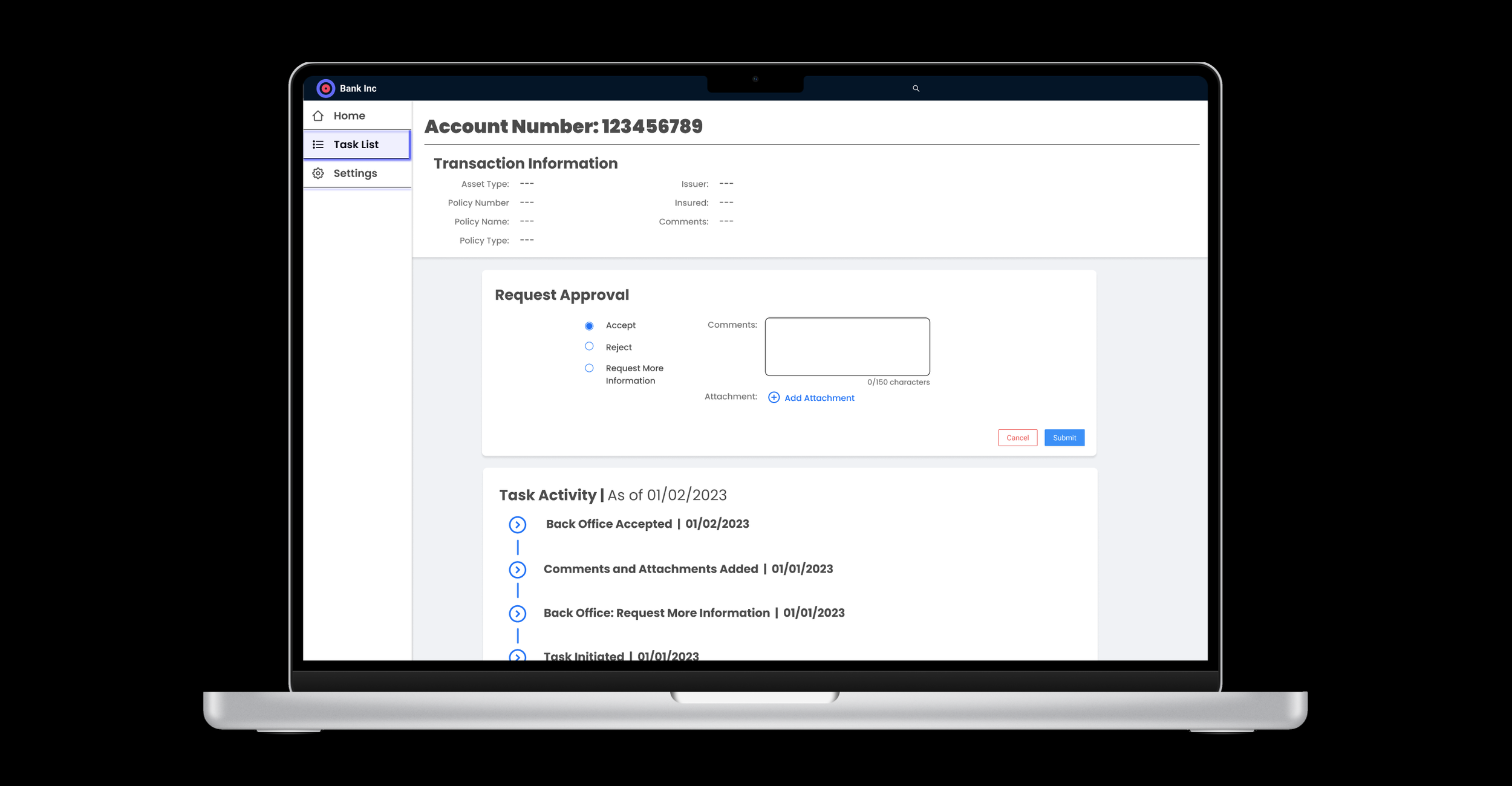
Below you will see a potential translation of the wireframes above into the internal design system. Please note: this is just representative of what is possible, not a direct representation of any previous clients.
Prototype
You can find prototype here, showing the interaction of the Task Activity component.

