Case Study: Fall 2020 Color Trends
Project Overview
Primary Questions for my strategy
What are the color trends for the upcoming 2020 Fall season?
How do I translate those trends for the user persona?
Research Phase
I began the process by scouring the early trend reports from WGSN. The initial reports gave me context and informed my initial point of view. The items
Initial information collection
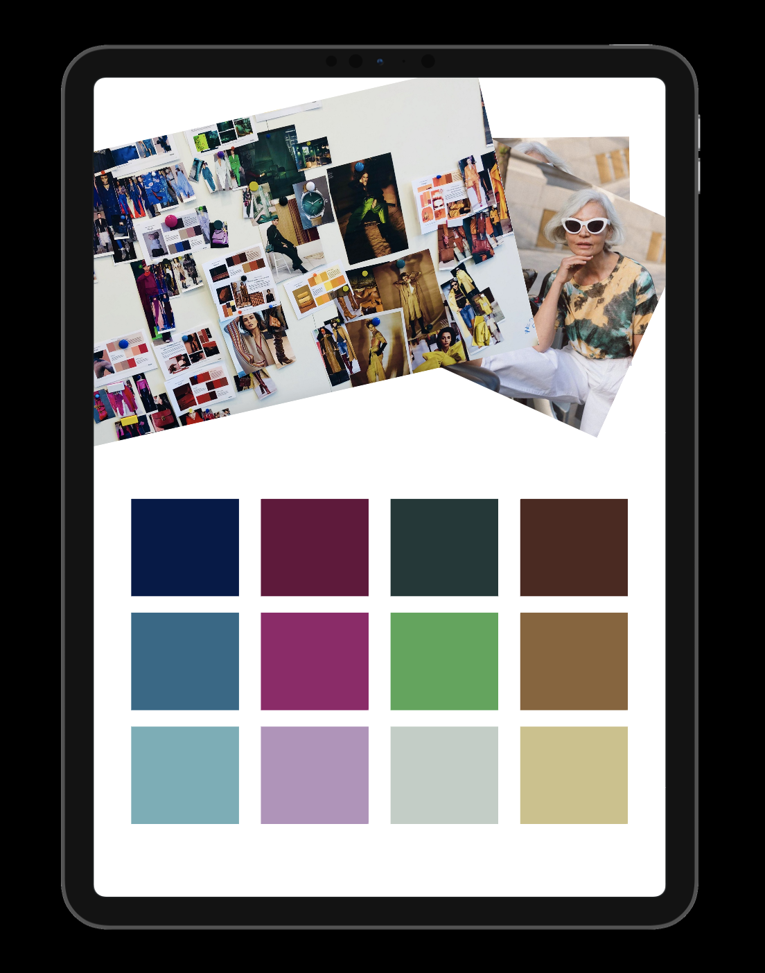
I printed all information, and pinned to the magnetic dry erase board. From there, I sorted the information into a high level affinity map. This gave me the prospective to start the next steps of pulling specific color information from the real life runway reports.
Runway Information Pull
Working my way around the color wheel, I pulled any relevant image showing that season’s interpretation of color. Again, I sorted these images into an affinity map; organizing each color next to its logical next step. This allowed me to understand the transitions between colors and how they relate to each other this season.
User Persona
The customer for the brand is well-established. She is 55+, affluent, and tends to be both practical, yet fashionable. She will try a trend after it has been established and will hang on to a trend slightly longer than the average, if it’s something she loves. She is aging, but doesn’t feel old and wants a wardrobe that accommodates her busy lifestyle.
Gen X Trendsetter
55+ woman, highly educated with a sophisticated sense of style with a practical streak
Photo Credit: Grece Ghanam Instagram - WGSN


