Strike for our Rights | Accessibility
Strike For Our Rights
Brand Standards & Accessibility
Project Overview
Context :
Strike For Our Rights is a U.S.-based 501(c)(3) nonprofit working to shift the collective culture to support, organize, and promote strikes in the U.S. as a means of advocating for justice, equity, and systemic change. I joined in the first months to help with design work needed to launch their group. The group is decentralized and relies heavily on ever shifting volunteers to create content, marketing collateral, and web initiatives.
Pain Point:
The decentralized nature of a volunteer group can create inconsistency in the execution of design.
The initial branding* did not include accessibility best practices and standards.
Many volunteer designers had limited experience with accessibility standards.
Solution:
Create an easy to reference, easy to understand reference guide for accessibility standards that specifically references the branding.
*Strike For Our Rights branding by Fuze Branding.
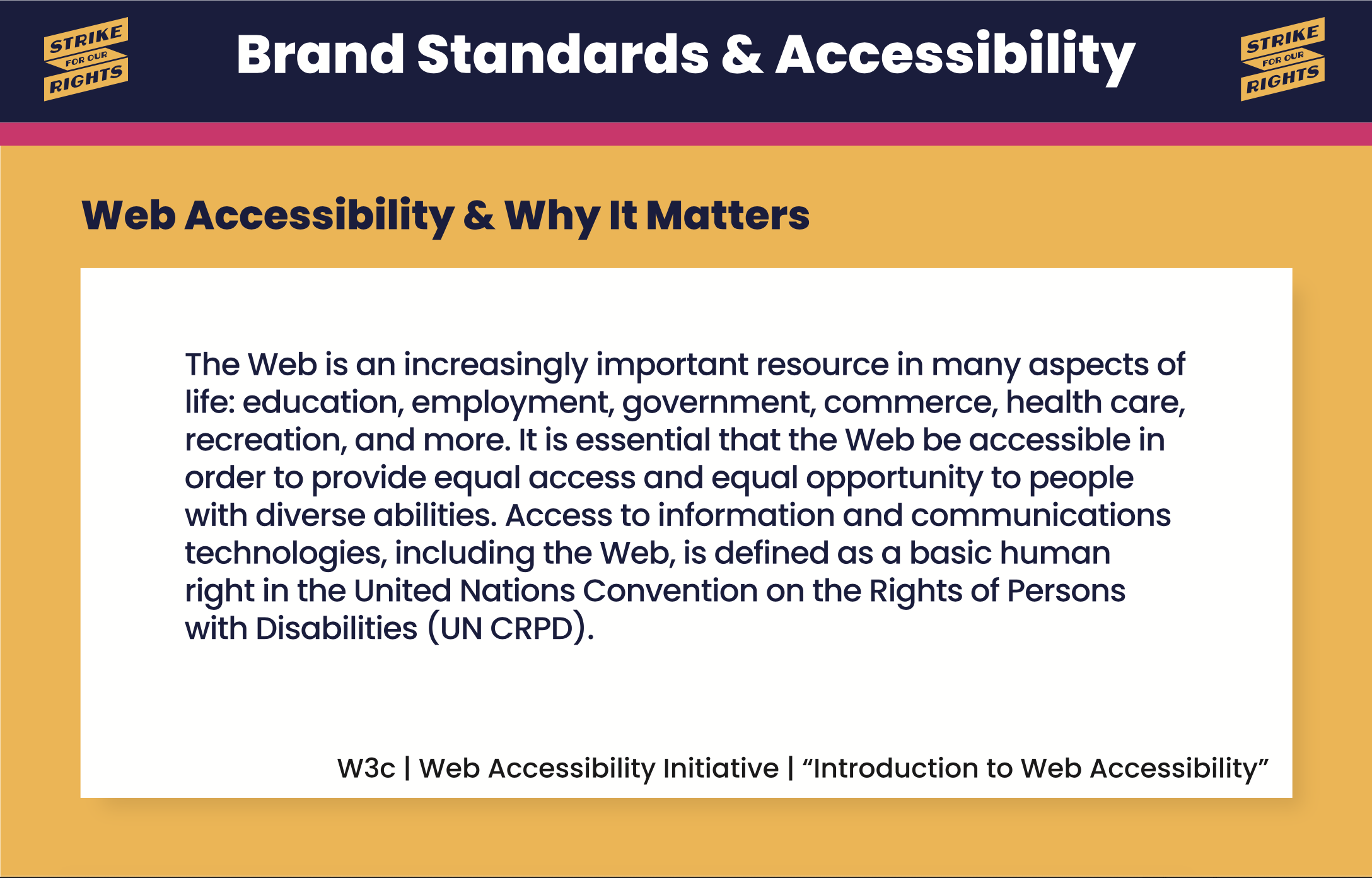
Slide Body: The Web is an increasingly important resource in many aspects of life: education, employment, government, commerce, health care, recreation, and more. It is essential that the Web be accessible in order to provide equal opportunity to people with diverse abilities. Access to information and communications technologies, including the Web, is defined as a basic human right in the United Nations Convention on the Rights of Persons with Disabiliites (UN CRPD). — W3c | Web Accessibility Initiative | “Introduction to Web Accessibility”
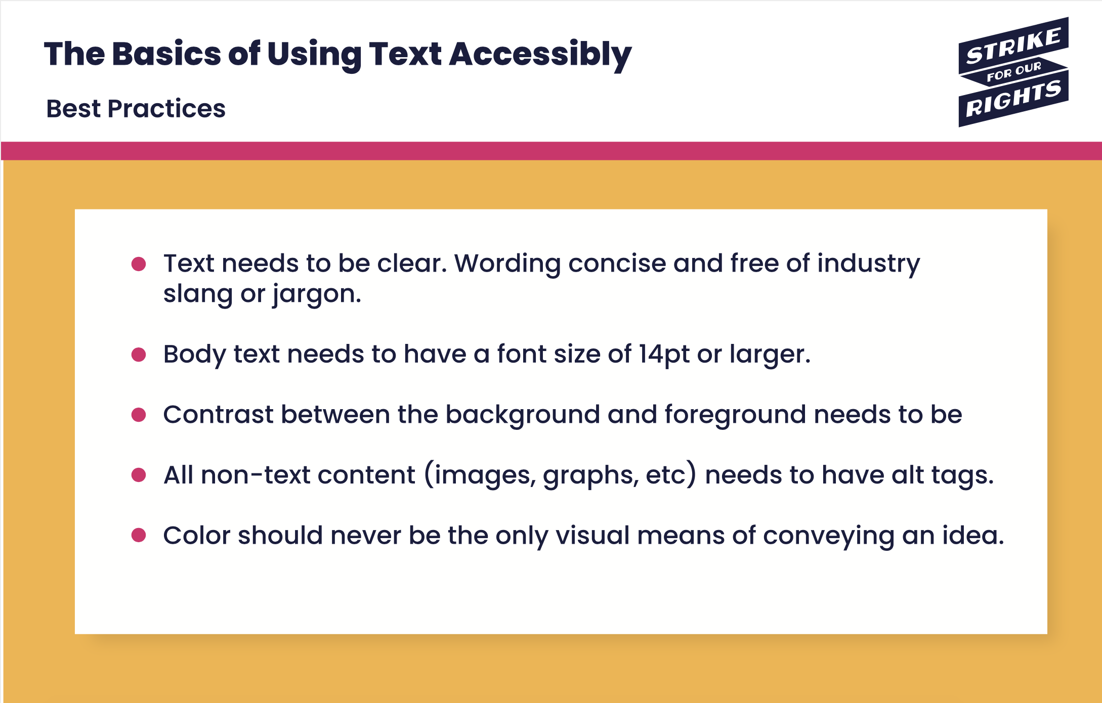
The Basics of Using Text Accessibly
Text needs to be clear. Wording concise and free of industry slang or jargon.
Body text needs to have a font size of 14pt or larger.
Contrast between the background and foreground needs to be
All non-text content (images, graphs, etc) needs to have alt tags.
Color should never be the only visual means of conveying an idea.
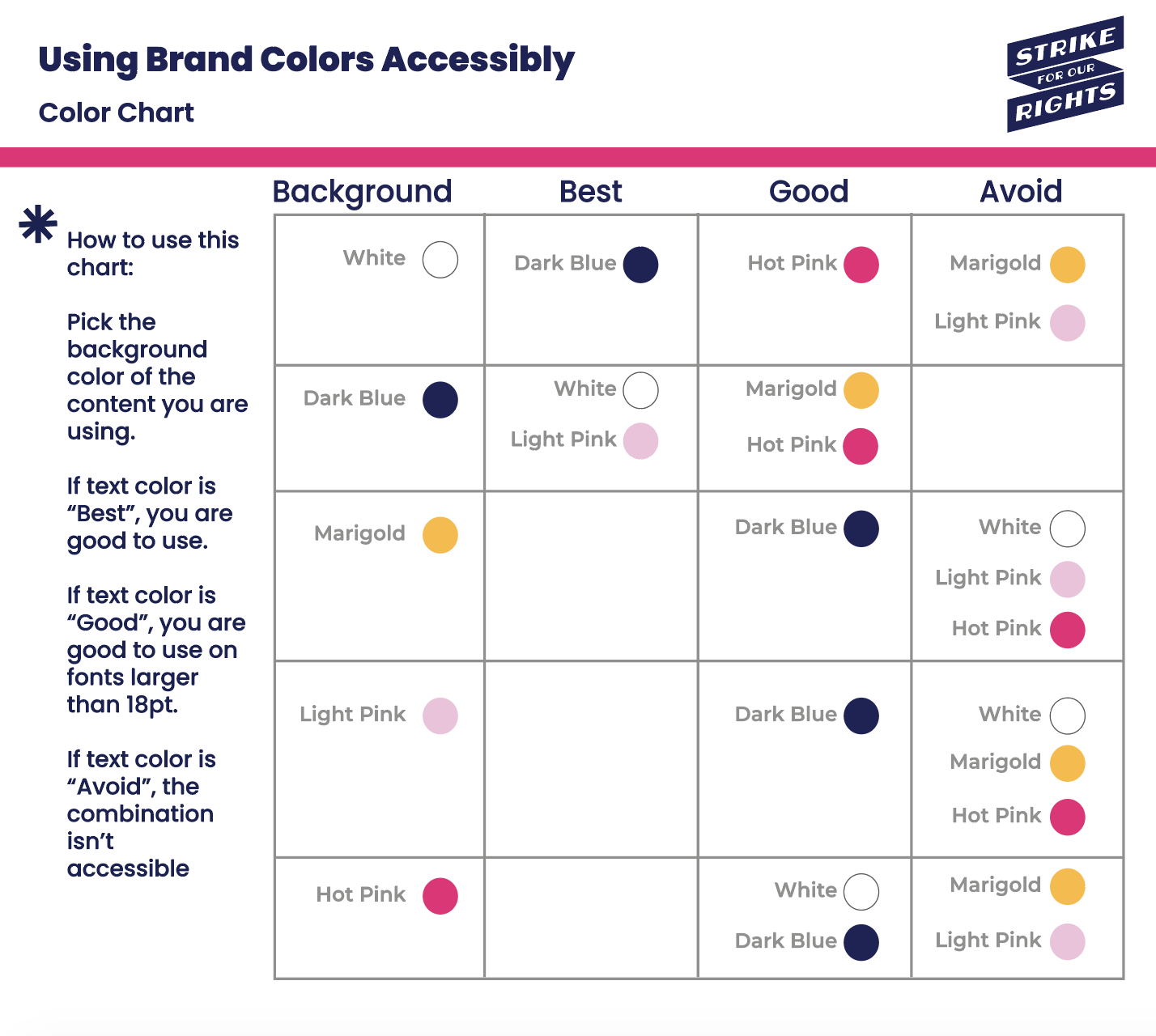
Using Brand Colors Accessibility: Color Chart Explained
How to use:
Pick the background color of the content you are using.
If text color is “Best”, you are good to use.
If text color is “Good”, you are good to use on fonts larger than 18pt.
If text color is “Avoid”, the combination isn’t accessible.
-
Best: Dark Blue
Good: Hot Pink
Avoid: Light Pink, Marigold
-
Best: White, Light Pink
Good: Marigold, Hot Pink
Avoid: None
-
Best: None
Good: Dark Blue
Avoid: White, Light Pink, Hot Pink
-
Best: None
Good: Dark Blue
Avoid: White, Marigold, Hot Pink
-
Best: None
Good: White, Dark Blue
Avoid: Marigold, Light Pink
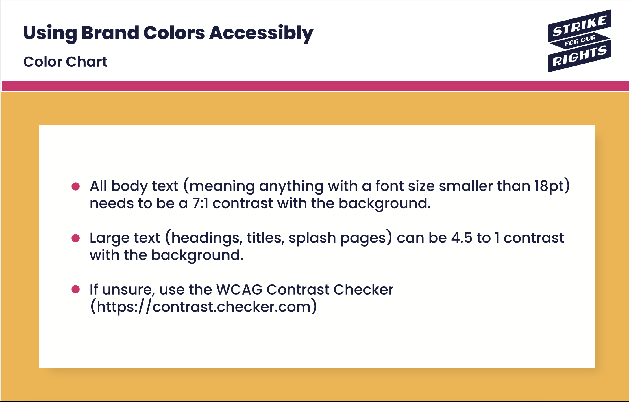
Using Brand Colors Accessibly, Color Chart (continued)
All body text (meaning anything with a font size smaller than 18pt) needs to be a 7:1 contrast with the background.
Large text (heading, title, splash pages) can be 4.5 to 1 contrast with the background.
If unsure, use the WCAG Contrast Checker (https://contrast.checker.com)
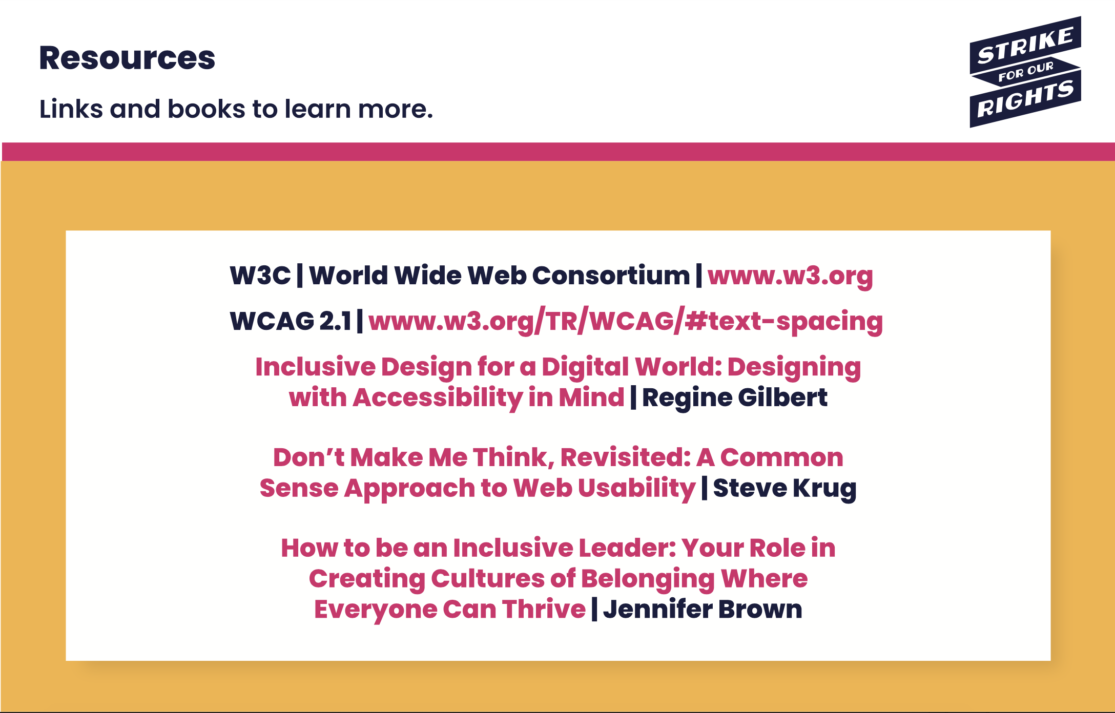
Resources | Links from Slide:
WC3 | World Wide Web Consortium | www.w3.org
WCAG 2.1 | www.w3.org/TR/WCAG/#text-spacing
Book: Inclusive Design for a Digital World: Designing with Accessibility in Mind by Regine Gilbert
Book: Don’t Make Me Think, Revisited: A Common Sense Approach to Web Usability by Steve Krug
Book: How to be an Inclusive Leader: Your Role in Creating Cultures of Belonging Where Everyone Can Thrive by Jennifer Brown
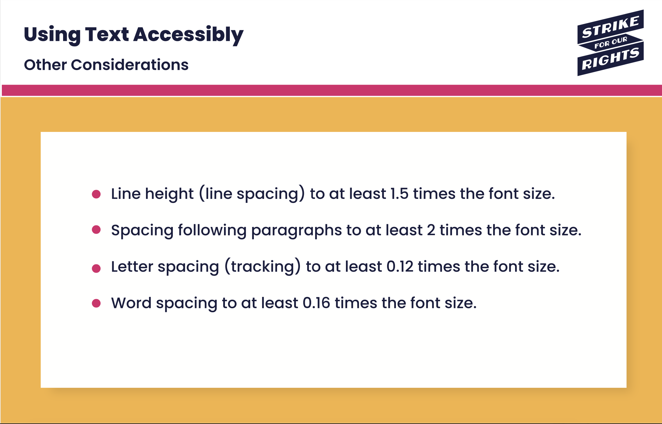
Using Text Accessibly | Other Considerations
Line height (line spacing) to at least 1.5 times the font size.
Spacing following paragraphs to at least 2 times the font size.
Letter spacing (tracking) to at least 0.12 times the font size.
Word spacing to at least 0.16 times the font size.